UX/UI Design
TechHelp Express Kiosk
Employee Tech Support and Resource Hub
Client / COX Enterprises
Role / Research and Design
Year / 2024
The Problem
COX offers many tech support options depending on employee preference and location. As the company moves away from remote work, it hopes to increase tech support accessibility by providing an option available on each floor through the TechHelp Express Kiosk.
Guiding Questions
How do users prefer interacting with their support agent?
How might we design the TechHelp Express Kiosks to be functional, intuitive, and inviting?
How can we increase user adoption across the COX campus?
The Solution
A support kiosk offering diverse tech support resources and additional functions to integrate into employees' day-to-day lives on the COX Enterprises Campus.


Timeline

Empathize + Define
Understanding our problem space
Evaluation Metrics
Task Efficiency
Considers:
- Efficiency
- Attention
Method:
- Observation
- User Test
- Survey
- Interview
Accessibility
Considers:
- Directness
- Informative
- User Support
Method:
- Survey
- Interview
Usability
Considers:
- Simplicity
- Flexibility
- Learnability
Method:
- Observation
- Survey
- Interview
Cognitive Load
Considers:
- Cognitive Load
- Physical Load
Method:
- Survey
- Eye-Tracking
Empathy
Considers:
- Joy/Surprise
- Satisfaction
- Attractiveness
Method:
- Survey
Competitive Analysis
.png)
This competitive analysis generated two key insights:
-
Kiosks typically have specialized functions allowing them to play unique roles for the user. These functions help the owners enhance efficiency when handling high-volume use.
-
Kiosks are highly related to the context of their environment, which indicates their role as a window of information and assistance in a physical space. The large screen brings opportunities for intuitive interaction.
Comparative Analysis
A comparative analysis of how tech support on the kiosk was projected to compare to other available tech support services was completed.
The kiosk was rated similarly to the in-person Tech Bar considering user experience and IT team use.
It provides a highly efficient and accessible tech support service.
Although the most highly rated, the kiosk did not beat out the alternatives by a large margin.
This outcome suggests that multiple tech support options on the kiosk may be more beneficial than limiting it to video-chat support.
.png)
Campus Observations

Capabilities
-
Can connect users to tech support via video calls
-
Provides AV services through tech support when the available cord is plugged into a device
-
Provides users with accessory vending and equipment lockers with badge identification
Location
-
Directly next to the elevators and across from the floor lounge
-
Easily accessible and visible to all employees on the floor
Accessibility
-
The kiosk is mounted to the back of the stand and cannot be adjusted
-
Limited access to able-bodied users of average height and wingspan
Research
Understanding our users
Survey
18 COX Enterprises Employees
Intentions
-
Determine COX employees' sentiment with available tech support options
-
Understand how employees from various departments utilize tech support
-
Identify the current benefits and pain points in existing tech support options
Insights
-
88.9% of respondents are satisfied with the current tech support options
-
83.3% of respondents felt the current tech support options were efficient
-
8 respondents did not believe the current options were easy to use
Semi-Structured Interview
8 COX Enterprises Employees
Intentions
-
Determine the current preferences and pain points with tech support services
-
Understand COX employees' daily routines and services frequently utilized at work
-
Gain in-depth and personalized answers about tech support experiences
Structure
-
30-minute interviews
-
Employees worked across 3 departments COX Enterprises
-
Produced 177 notes that were then converted into an affinity map to identify relevant themes

Key Insight #1
Employees do not like going out of their way to receive tech support
Key Insight #2
Employees typically stick to the tech support type they are most familiar with
Key Insight #3
Employees prioritize efficiency and direct attention when they seek tech support
Key Insight #4
Employees struggle to find the physical location of different rooms and services across campus
Key Insight #5
Employees feel COX provided resources are often scattered and difficult to locate when needed
Landscape Analysis
Publicity Analysis | Pedestrian Density Simulation
Intentions
-
Determine where the TechHelp Express Kiosk should be located
-
Understand what areas provide the kiosk the most visibility and accessibility
Insights
-
The kiosk's current location has both high foot traffic and high publicity
-
The kiosk should remain in the same location between the elevators and lounge


User Needs
Design implications
.png)
Ideation + Design
Brainstorming and idea generating
Persona
Possible user generated by the common experiences employees described at COX
.png)
Empathy Map
The most frequently expressed attitudes of COX employees and tech support users
.png)
Crazy 8s
Each member of my team quickly sketched eight potential kiosk features in eight minutes
The features were meant to address at least one of the user needs we had identified during our research
We then came together and each explained our ideas and narrowed them down to the best ones

Prototype
Bring our ideas to life
Sketches
Based on design implications and ideation techniques
Tech Support
The first set of features we focused on was tech support as that was COX's initial intention for the kiosk.
Because personalization and efficiency were such common concerns, we included multiple support options and their availability.
The "Common issues" button was included to streamline the tech support process and reduce undesired interactions.
.png)
DI1, DI2, DI3, DI4, DI7
COX Information
This set of features was intended to consolidate information from across multiple platforms for added ease.
Many employees struggle to locate rooms and resources on unfamiliar floors, leading to the floor map and room reservation features.
These campus-relevant features can increase user adoption by allowing the kiosk to be more heavily integrated into employees' work life.

DI4, DI5, DI6
Life at COX
These features support community engagement, a key employee-named benefit of working in the office.
Ordering food from the on-campus cafe and answering a weekly poll can be done in passing or waiting for the elevator.
Including "for fun" and quick features is intended to raise user adoption and reduce potential intimidation of a new technology.
DI4, DI5

Ergonomic Analysis
Touch and visual limits based on average height of the sexes


50 Percentile Male
50 Percentile Female
Initial Feedback Sessions
Employee Survey
To ensure our designs adequately addressed their needs, we sent the previously interviewed employees a survey with sketches of each feature.
Seven COX employees responded with written feedback and their ratings of each feature.
Group Interview
We conducted a 30-minute interview presenting each set of sketches to our COX sponsorship team to ensure our features feasibly met their expectations.
The interview included four COX team members and invited their questions and critiques.
Design Requirements
DR #1
COX branding must be used for wording and interface format to ensure ease of user adoption.
DR #2
Each screen must include clear buttons for navigation to aid in onboarding and ease of use.
DR #3
Department specific information should be displayed when possible, such as on the Events page.
DR #4
All touch interactions should be limited to the lower half of the screen to ensure user comfort.
DR #5
All important visual information must be on the lower three quarters of screens to ensure uscomfort.
Wireframing
We placed our existing sketches into a lo-fi wireframe and added follow-up screens to extend the feature's complexity. This allowed us to add the necessary screens for a smoother flow between features.
We then focused on incorporating the new design requirements into the wireframe. This is when we began to add navigation buttons and the COX branding colors and fonts to each screen for a cohesive UI. Once all the necessary features were added, we placed guidelines over each screen to ensure crucial touch and visual information were within the current region.
After meeting the set guidelines, we refined our screens and separated the prototype screens by feature to ensure all connections and screens were included. Once finalized, the prototype was ready for user testing and evaluation.
Evaluate
Finalizing the UI
Expert Evaluation
Three experts evaluated how the kiosk prototype compared to Nielsen's 10 Usability Heuristics.
They were asked to rate each heuristic from 0-4, "Not an issue" to "Usability catastrophe."

Key Insight #1
The average score for each heuristic was 1.067, classifying all usability issues as "Cosmetic problems" to be addressed in future iterations
Key Insight #2
The maximum average score given for any heuristic was 1.667 for items 3 and 5, showing higher, but cosmetic, difficulty with icons and jargon
Key Insight #3
The only other heuristics that scored above an average of 1 were 9 and 10, suggesting a need for error prevention and redirecting screens
User Evaluation
The user evaluation station was set up on the COX campus and participants were obtained through convenience sampling.
A total of 32 COX Enterprises employees participated, 18 male and 14 female.
Participants were asked to complete seven tasks with no guidance to determine novel usability but were allowed to ask clarifying questions at the end.
Each participant wore eye-tracking glasses to record visual attention and cognitive load.
After completing the tasks and discussing feedback, participants completed a System Usability Scale (SUS) form to determine common pain points.
1
Begin a video chat with a tech support agent
2
Send a live chat message to a tech support agent
3
Add an event to your calendar
4
Complete the Weekly Question poll
5
Find the desk area closest to the bathroom on Floor 9
6
View all Meeting Rooms and Desks on the 9th floor
7
Attempt to view the map for other buildings
Key Insight #1
The labels used across the prototype do not always match their function
Key Insight #2
Users like checking space availability even when not reserving a space
Key Insight #3
The pop-up to continue with tech support needs to have a smaller QR code
Key Insight #4
Users expect to quickly find relevant help articles on the "Common Issues" page
Key Insight #5
The "Interactive Map" needs to offer users more instruction
Key Insight #6
It is unclear that the "Interactive Map" icons are not clickable
Key Insight #7
Multiple users struggled to find the floor information using the "Interactive Map"
Key Insight #8
The prototype is missing mavigation markers
Key Insight #9
Users want more flexibility in how they view information on the kiosk
Final Design
Finalizing the UI
Features
Finalized flows for each included feature
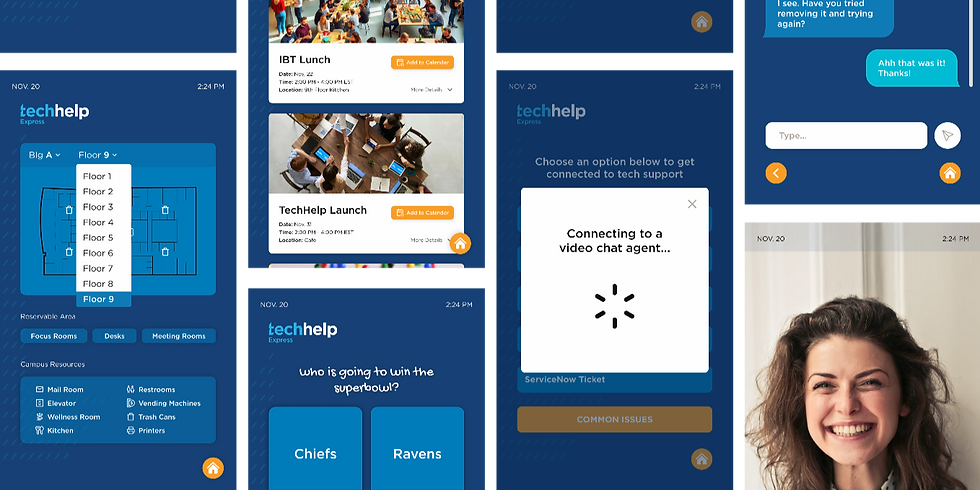
Tech Support
-
View service availability and select live chat
-
Scan the QR code or begin chatting on the kiosk
-
Connect with a support agent and start chatting
-
Can switch to phone call or video call according to personal needs

Interactive Map
-
Select the building floor
-
(current floor by default)
-
-
View reservable areas and campus resources
-
Select a reservable area of interest
-
Connect with Condeco app to reserve

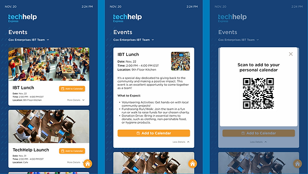
COX Events
-
Select event filter
-
(current floor's department by default)
-
-
Scroll through upcoming events
-
View details for more information
-
Select "Add to Calendar"
-
Scan the QR code to register for the event
.png)
Weekly Question
-
Complete the weekly poll or view the leaderboard without voting
-
View leaderboard results
-
Go back to the main menu
